
XGRAPH
General Purpose 2-D Plotter
Contents:
- Overview
- Data file formats
- Invocation / Usage
- Command-line Options
- Embeddable Commands
- Plotting Functions & Equations Interactively
- Postscript Hardcopy Printing
- Export to Publishing Tools - EPS
- PDF (Portable Document Format) Export
- Sending Live-Data to XGRAPH from running programs via socket(s).
- Customizing / Editing Graphs
- Compressed Input
- Download XGRAPH
1. Overview
XGRAPH is a general purpose x-y data plotter with interactive buttons for panning, zooming, printing, and selecting display options. It will plot data from any number of files on the same graph and can handle unlimited data-set sizes and any number of data files.XGRAPH produces wysiwyg PostScript, PDF, PPTX, and ODP output for printing hard-copies, storing, and/or sharing plotted results, and for importing, graphs directly into word-processors for creating documentation, reports, and view-graphs.
XGRAPH includes the ability to specify plotting colors for multi-color plots, as well as line-thickness. It has the ability to use any column of a multi-column file as ordinate and abscissa axis. It also supports automatic resizing of its window. Zoom interactively into any region of a graph by simply dragging a box around the region with your mouse.
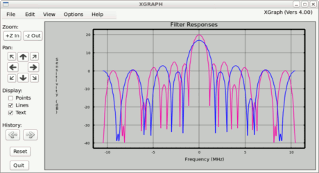
- Example (click to enlarge) -
Plot-file data can be conveniently manipulated with general purpose
utilities, such as  .
.
2. Data File Formats
XGRAPH expects data in an x y format. Typically, this is one x-y data-point pair per line. Data values may be separated by white-space (spaces or tabs), commas, semi-colons, or colons.Multi-column data has several values per line. Each value, or column, is separated by white-space (spaces or tabs), commas, semi-colons, or colons. Any column can be selected as the ordinate or the abscissa by the '-c' column option.
2.1 Multi-Column Data Files -
To view multi-column data files, use the '-c' option ahead of the file containing the multi-column data. Once toggled, the plotter stays in multi-column mode until toggled out of that state with another '-c' option. For instance:xgraph f1 -c m1 m2 -c f2Files f1 and f2 would be interpreted as one xy-pair per line files, while files m1 and m2 would be interpreted as multi-column files. For multi-column files, xgraph will prompt for which columns to use as the ordinate and abscissa values. Columns are considered to be numbered 1 - N, where 1 is the first or left most column. Column 2 is the second column, etc..
A convenient way to switch the axes of a simple xy-pair file is to treat it as a multi-column file (having two columns), and use columns 2 and 1 as the abscissa and the ordinate respectively.
To plot multiple columns from a single file, list the file several times on the command line. For instance to plot columns 3 and 5 against column 2 from file xyz:
	xgraph -c xyz xyz

 and respond when prompted with:

	2 3
	2 5

 as the columns for the abscissa and ordinate axes respectively.
To specify the column numbers on the command-line instead of being prompted interactively, use the '-columns' option. For example:
xgraph -columns 1 5 test.dat
2.2 Multiple Curves, Lines, Plots:
You may place multiple plots in a given file, by placing the keyword, 'NEXT', between the distinct curves, lines, or plots in your data listing. This is useful for drawing distinct shapes, etc., that are not connected to each other. 'Next' instructs the plotter to perform a 'pen-up'-'pen-down' operation, thus breaking the connection between a set of points.Multiple curves can also be drawn by including data from separate data files. There is an implicit 'pen-up'-'pen-down' that breaks the connecting line between data plotted from different files.
2.3 Comments -
Comment lines are embedded in data files, by placing an exclamation mark ('!') in the first column of a line.Example, ! Two points make a straight line. ! (x,y) 0 5 2 6Blank lines are allowed anywhere.
C-style /* ... */ comments are also allowed. These enable commenting multiple-line sections of data files. The C-style comments are convenient for encapsulating large blocks textual explanations that are to be kept within the data file(s).
	Example,
		/* Two points  make a straight line.
		      ( x,  y )
		*/
		0        5
		2        6
3. Invocation:
To invoke XGRAPH, add an alias in your .login file that points to where XGRAPH is installed. For example:alias xgraph '/home/bart/graph/xgraph'Then type xgraph with your data file specified on the command-line. For instance, to plot data in file f1.dat:
xgraph f1.dat
3.1 Interactive / Batch Usage:
XGRAPH can be used either interactively, or non-interactively from batch command-files or script-files.- Interactive - The default mode is interactive. When invoked, the
graph-window appears with a control-panel of buttons.
The button operation is described below.
You may interactively select an area of a graph to zoom into by
dragging a rubber-band line around a region of your graph with the
left mouse button. Upon releasing the button, the graph will re-scale to zoom
into the desired region. You can also zoom in-and-out and pan with the control-panel
buttons. To return the display to its original scale, -perhaps to re-zoom into
a different region-, hit the Reset button.
Clicking anywhere within a graph will display the point's coordinates in the terminal window. If you click on one point and then click on another, the difference, or distance, between the two points is printed. In general, it prints the difference between the current point and the last point clicked. Similarly, if you stretch a box around some function on your time-line graph, it will print the range of time spanned.
- Batch-Mode - XGRAPH can be used when no windowing interface is available, or it is not desired to view data on the screen. This situation may occur, for example, when working remotely, or when automatically generating reports over-night. To use XGRAPH in this mode, simply place the -ps, -eps, -pdf, -odp, or -pptx options on the command-line. This will prevent the display from attempting to open on a screen, and will send the graph directly to specified file format. The output file can then be printed or viewed (immediately or at a later time).
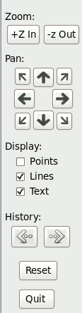
3.2 Window Button Controls:
The window buttons on the left control panel offer the following interactive capabilities:
+Z-in Button - Zoom in. Scales range by 0.5x. -Z-out Button - Zoom out. Scales range by 2x. Pan_^ Button - Pan up. Moves graph's vertical window range upward by 25% of current range. Finer panning can be achieved by first zooming-in, then panning, and then zooming back out. Pan_< Button - Pan left. Moves graph's horizontal window range leftward by 25% of current range. Pan_> Button - Pan right. Moves graph's horizontal window range rightward by 25% of current range. Pan_v Button - Pan down. Moves graph's vertical window range downward by 25% of current range. Points/Lines Toggles - Switches the points/lines drawing mode between the three options: 1.) Lines only connecting points, 2.) Points identified on lines by small shapes, with connecting lines. 3.) Points only identified by small shapes (no connecting lines). Text Toggle - Enable or suppress textual annotations. By default, textual annotations are visible. Pressing the annotations button disables or enables the display of any annotations embedded in data files. Back/Forward History - Go back to the previous zoom or pan position. Remembers multiple levels of zoomin/movements. Reset - Reset all modes and zooming levels, re-read the data files, and redraw the graph. Quit Button - Quits the graph window. |
|
4. Command-line Options:
The XGRAPH program contains many options for presenting graph data. To see a list of the options, press the help button, or invoke the xgraph with the '-help' command line option. The options are used for changing default settings.Most display aspects can be changed interactively from the graph control-panel, so the command-line options are often more of a convenience. They enable the graph to come up in a desired mode without pressing more buttons.
For non-interactive or script-driven usage, the command-line options are essential. They enable display modes to be set, or hardcopy print-outs to be generated, without the need of an interactive display for pressing buttons.
Below is a quick summary of the command-line options, followed by detailed descriptions of the important options.
4.1 Options Summary:
	-c	If your data is arranged in columns, then you will
		be prompted to select individual columns.
	-color  Specify the color that data from a file is to be drawn in.
	-columns - Specify columns on command-line.
	-sann	Suppress annotations.
	-a	Expect y values only.  Generate the x values internally
		by a simple counter.
	-p	Just plot points, without connecting lines.
		Uses tick-mark shapes of circles, squares, triangles for each
		successive curve.
	-pl	Plot points with lines.  This shows where the data
		samples were on the curves with tick-marks.
	-psz    Specify point-size of shapes for -p and -pl.  (Default=0.1)
	-ps	Non-Interactive PostScript output.  Useful for batch
		script-driven jobs.
	-eps	Non-Interactive Encapsulated PostScript output.  Useful for
		batch script-driven jobs.
	-pdf	Non-Interactive PDF (Portable Document Format) output.
		Useful for batch script-driven jobs.
	-odp	Non-Interactive ODP (OpenOffice Document Format) output.
		Useful for batch script-driven jobs.
	-pptx   Non-Interactive PPTX (Powerpoint Document Format) output.
		Useful for batch script-driven jobs.
	-sxi	Non-Interactive SXI (Older OpenOffice Document Format) output.
		Useful for batch script-driven jobs.
	-help	Prints this list of options.
	-titles Toggle titles on graph axis.
	-text   Put extra text on graphs.
	-x_range Specify X-axis range.  Must be followed by two values.
		If specified before files, used as Soft outer limits which
		will be stretched if data values exceed given range.
		If specified after files, used as Rigid range which will
		restrict graph boundaries even if data exceeds given range.
	-y_range Specify Rigid Y-axis range.  Must be followed by two values.
		If specified before files, used as Soft outer limits which
		will be stretched if data values exceed given range.
		If specified after files, used as Rigid range which will
		restrict graph boundaries even if data exceeds given range.
	-g	Impose geometric equality of scale on both axis.
	-ng     Specifies no grid, turns grid off.
	-ngrids_x  Specify number of horizontal axis grid tick-marks.
	-ngrids_y  Specify number of vertical axis grid tick-marks.
	-snap   Snap image of graph without displaying. For background processing.
	-out_file  Specify postscript output file name.
	-bw	When printing, make postscript for black and white printer.
	-xlog   Plot X-axis in log vs. linear (ex. for log-lin or log-log plots).
	-ylog   Plot Y-axis in log vs. linear (ex. for log-lin or log-log plots).
	-shape  Specify point-shape to be used to graph the next file.
	-lower_boundary - Position of lower graph border.
	-upper_boundary - Position of upper graph border.
	-left_boundary 	- Position of left graph border.
	-right_boundary - Position of right graph border.
	-noabbrev  	- Do not shorten axis labels with "..".
	-liv4 xx  	- Automatically exit after xx seconds.
	-wbgr   	- White background.  Use white background instead of default black.
	-monitor_files xx   	    - Re-check files every xx seconds, and replot if changed.
	-monitor_files_rescale xx   - Re-check files every xx seconds, and replot and rescale if changed.
				      The value of seconds may be a decimal value, such as 0.5.
4.2 Axis Ranges (-x_range, -y_range):
By default, the XGRAPH utility is self scaling. That is, XGRAPH will pick the necessary axis ranges to exactly contain all the data you present to it. There are however occasions when you may wish to use specific axes ranges of your own. You can specify the range for the vertical and/or horizontal axis by using the '-x_range' and '-y_range' command-line options. This provides an easy way of quickly zooming into a particular region of your data, or of maintaining consistent axes ranges among several graphs.Specify the horizontal axis range with:
-x_range min_x max_xwhere min_x and max_x are your desired range limits for the axis. Specify the vertical axis range as in:
-y_range min_y max_ywhere min_y and max_y are your desired range limits for the axis.
You can use these to express 'hard' or 'soft' ranges. A 'hard' range means that the graph will be clipped exactly to the specified range, regardless of whether your data covers that range or exceeds it.
A 'soft' range means that the graph will be drawn out to that range even if your data does not span that range, but if data exists outside that range, the range will be extended to include the data.
You control the 'hardness' or 'softness' of your optionally specified ranges by where you place them on the command-line. If placed first on the command-line, the range specifier is 'soft' in that it acts merely as a minimum range. Any data coming afterward that exceeds that range will expand it. If placed last on the command line, the range specifier is 'hard' in that it sets the range to the specified value regardless of what the data range was that came before it.
The axes data ranges and their 'hardness' or 'softness' are independently controlled for the X and Y axes. For instance, you can specify the X-axis range, but let the Y-axis auto-scale to the data, by simply specifying only an X-axis range, or vice-verse.
If you are using XGRAPH interactively, you can use the range specifiers to set the initial ranges. Then you can move around with the pan and zoom buttons, once you are inside the graph.
4.3 Changing Graph Placement on Page:
You can specify the location and size of the graph on the printed page by specifying the upper, lower, left, and right boundary positions. This is useful for instance to shrink the graph to fit textual explanations under it, above it, or on the side. The boundaries are specified independently either on the command line or within a data file using the following:On command line: -upper_boundary <position> -lower_boundary <position> -left_boundary <position> -right_boundary <position> In file: upper_boundary = <position> lower_boundary = <position> left_boundary = <position> right_boundary = <position>where the <position> is in inches from the top of the 8.5-inch high page. Default position: upper_boundary=0.5, lower_boundary=7.0, left_boundary= 2.75, right_boundary=10.5.
4.4 Specifying Number of Divisions on Axes and Grids -
You can specify the number of divisions on each axis by the '-ngrids_x' and '-ngrids_y' command line options.Example: -ngrids_x 8Will attempt to divide the axis into 8 tick-marks. The default values are: ngrids_x = 5, ngrids_y = 7.
4.5 Specifying Columns to Plot -
To specify the column numbers on the command-line, use the '-columns' option. For example:xgraph -columns 1 5 test.datThis will plot column 5 against column 1 from test.dat.
4.6 Log-Axis Plots
You can plot with logarithmic axes by placing the -xlog and/or -ylog options on the command line. The -xlog causes the horizontal axis to be logarithmic, while -ylog causes the vertical axis to be logarithmic. As opposed to the standard linearly scaled axes, the logarithmic scaled axes are useful for viewing data spanning very large ranges. The data of higher range values are displayed in a progressively compressed fashion.Note: The data to be graphed on a logarithmic scale cannot be negative or zero. If XGRAPH encounters negative or zero data for a logarithmic axis, it prints a warning message and exits.
Example:
        xgraph -ylog  test.dat
4.7 Font Sizes
You can specify font sizes on the command line with:- -fontsize_titles - Specify size of the graph-title, and axes titles. Default = 12.
- -fontsize_axes - Specify size of the numbers on the axes scales. Default = 9.
- -fontsize_anno - Specify size of any graph annotations. Default = 8.
Example:
        xgraph -fontsize_titles 8
4.8 Piping Input
You can pipe data into xgraph from other programs by using the - (dash/hyphen) symbol where a file name would be on the command line.Example:
generate_data | xgraph -x_range 0 10 -y_range 0 10 -Due to the nature of piped input, (specifically that it comes in once and cannot be re-scanned like a file), the X and Y axes ranges must be known prior to the arrival of piped input. The piped input data is then plotted as it arrives. Therefore, it is necessary to set the axes ranges with the -x_range and -y_range directives prior to the "-", as shown above. Also, because the piped input cannot be re-scanned, you cannot re-size the graph interactively. Piped input is also useful for generating hardcopy output non-interactively with the -ps or -pdf options.
4.9 Days, Hours, Minutes, Seconds - Time Axes
For plotting activities across time-ranges spanning several hours or days, it is convenient to display the time values on the horizontal time-axis in D:H:M:S, or Day:Hour:Minute format, instead of linear seconds, or linear hours, etc.. D:H:M format is more easily interpreted and is more meaningful in many scenarios. For example, 12:30 is more easily understood as half-past noon, than the same value in seconds (45,000) or minutes (750).The following command-line options control the displayed axis numbering format:
- -hms - Display Hours:Mins:Secs, (no days).
- -dhms - Display Days:Hours:Mins:Secs.
- -dhm - Display Days:Hours:Mins.
- -dh - Display Days:Hours.
XGRAPH assumes the abscissa (x-axis) values are in Seconds by default. Other units can be specified by the -time_units command-line option, which can accept the following values:
- -time_units minutes - Use when x-axis input values are in minutes. (Can be abbreviated min.)
- -time_units hours - Use when x-axis input values are in hours. (Can be abbreviated hr.)
- -time_units days - Use when x-axis values are in days. (Can be shortened to day.)
- -time_units seconds - Use when x-axis values are in seconds. (Can be abbreviated sec.)
This is the default setting and is not necessary other than for clarity.
5. Embeddable Commands
There are several embeddable commands that are described in this section. You place these commands within your data-files.5.1 Color specification -
You can specify the color of curves, lines, and points by embedding color specifications in your data files. (The color command must be placed on a line by itself.)Command Syntax: color = <color_choice> Example: color = blue Action: The color of any lines drawn after this command will be 'blue'. Valid color names are: 0 = black, (caution on black screen background) 1 = white, (caution on white paper printout) 2 = red, 3 = blue, 4 = green, 5 = violet, 6 = orange, 7 = yellow, 8 = pink, 9 = cyan, 10 = light-gray, 11 = dark-gray, 12 = fuchsia, (default plotting color) 13 = aqua, (border color) 14 = navy, (grid color) 15 = gold. (text color)You can switch back and forth between colors as many times as you like within your files.
You can use either the color names or numbers (also called pen-numbers).
There is also a rainbow of 128 extra (un-named) color pens numbered
16 - 143. You can use them as, for example: color = 102 .
They are arranged by color as in the rainbow pictured below:
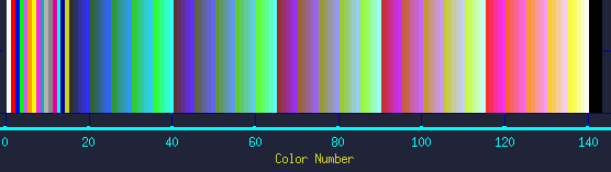
You can download this rainbow.dat file and plot it
(xgraph rainbow.dat).
Or generate the rainbow yourself by the following C program, rainbow.c:
		#include <stdio.h>
		main()
		{
		 int j;
		 FILE *outfile;
		 outfile = fopen("rainbow.dat","w");
		 fprintf(outfile,"Thickness=3\n");
		 fprintf(outfile,"title_x=Color Number\n");
		 for (j=0; j<=144; j++)
		   fprintf(outfile,"color=%d\n%d 0\n%d 1\nnext\n", j, j, j);
		 fclose(outfile);
		}

	Compile it:	cc rainbow.c -o rainbow
	Run it:		./rainbow
	Plot it:	xgraph rainbow.dat
Either way, you can zoom-in to see exact color values.
You can also specify your own colors by the set_color command.
set_color cn = ( r, g, b )Where cn is the color-number, r is the red-value, g is the green value, and b is the blue value. The color values range from 0 to 255, where 0=dark, and 255=bright. For example:
set_color 138 = ( 0, 230, 200 )... Sets color 138 to be a green-ish aqua color. You may set any of the valid color-pens numbered 0 to 143. Note that color-pen 0 is the background. Colors 141, 142, 143 are particularly suitable for custom colors, as they are available but not set to any default color. (By default, they are black.) But any of the lower color-numbers can also be redefined.
You can also specify color on the command line using the -color command-line option. With it, you can specify a separate color for each of several files plotted from the command-line. (Any embedded color commands will override the command-line settings.)
Background, Border, Text Colors
The display colors of the background, borders, and text can be set by the environment variables:- XGRAPH_BACKGROUND
- XGRAPH_BORDERCOLOR
- XGRAPH_TEXTCOLOR
These take values in the form of RRBBGG, ranging from 000000 through ffffff. Where each red/blue/green color is specified as a two-digit hex value, 00 = 0-decimal (dark) through ff = 256-decimal (bright).
For example:
	000000 = Jet-Black.
	808080 = Gray.
	ffffff = Bright-White.
	880000 = Medium Red.
	008800 = Medium Blue.
To set the environment variables, use for example:
setenv XGRAPH_BACKGROUND 005858Once set, the setting will be valid in the current shell throughout the session. (To suit personal preferences, the environment variables can be set in your .cshrc or .login files.)
These color settings will affect the screen display and image output file colors. The background color will not affect the Postcript, PDF, or Office output-file colors. (The B&W print option sets all objects to black for best display on non-color printers.)
The default colors are:
	setenv XGRAPH_BACKGROUND 123b12
	setenv XGRAPH_BORDERCOLOR 00ffff
	setenv XGRAPH_TEXTCOLOR d112d1
To remove the settings, use for example:
	unsetenv XGRAPH_BACKGROUND
	unsetenv XGRAPH_BORDERCOLOR
	unsetenv XGRAPH_TEXTCOLOR
A good white background can be set with the -wbgr command-line option, or by setting the following environment variables, this time using the equivalent bash-shell commands:
	export XGRAPH_BACKGROUND=d0f0d0
	export XGRAPH_BORDERCOLOR=000000
	export XGRAPH_TEXTCOLOR=000000
5.2 Line Thickness -
   Command Syntax:
		thickness = <value>

   Example:
		thickness = 2.5

   Action: The thickness of any lines drawn after this command will be
	   2.5-points wide.  A point is defined as 1/72-inch.

	   Note that for screen displays, dimensions are scaled such
	   that the window size is always considered to be an 8.5x11
	   inch sheet of paper, regardless of the actual size of the
	   display window.  This ensures that manipulations of your
	   graph will appear on a printout as they do on your screen.
	   It also ensures that line widths do not vary with the range
	   of your data, or the extent that you zoom in or out.
5.3 Titles:
You can add TITLEs to your graph and axes by embedding any of the following in the data file:
   title_x = <any text you choose>
   title_y = <any text you choose>
   title = <any text you choose>

   Examples:
            title_x = Time (uS)

    This will put 'Time (uS)' under the X-axis.


            title_y = Device Name

    This will put 'Device Name' to the left of the Y-axis.


	    title = Experiment 5: Two Search-mode Subgraphs.

    This will put 'Experiment 5: Two Search-mode Subgraphs.'
    across the top of the graph page.
You can turn the titles off by invoking XGRAPH with the '-titles'
option ahead of a graph's file-name on the command line.
The -titles option has a toggling affect, as do most of the
other options, so you can turn it on-and-off several times
across the command line to plot each file with different
options.
Specifying -titles a second time on the command line will turn
the title sensitivity back on. This allows you select which files
to include titles from when you are superimposing several files.
  Example 1:

       xgraph  -titles  f1.dat  -titles  -f2.dat

     (This will only take titles from the f2.dat file.)
Sometimes it is convenient to have a dedicated file,
that have nothing but the common titles you like to use as in:
xgraph result.dat velocity_graph.titles
5.4 Annotations -
You may place textual annotations directly on your graphs, for instance to identify curves, etc.. To do this, simply place an 'annotation' line on a line in a data file. An 'annotation' line begins with the keyword, 'ANNOtation', (where the caps are required, and the smalls are optional). This is followed by the X-Y coordinates of where the annotation text should appear on your graph. And these are followed by the annotation text itself until the end of the line.The form is: annotation <X> <Y> <text> For example: anno 5.2 78.0 Second Experiment ResultsThe X-Y coordinate data are in the same coordinate system as your data (in other words, its not screen-coordinates, but data-coords.). The coordinate refers to the bottom left-hand corner of the text string.
To suppress annotations from appearing on you graph, you can use the '-sann', 'suppress annotations' command line option, or hit the Toggle-Annot button on the control panel.
5.5 Additional Text on Graph:
If you are sending your plot to a laser printer, then you may wish to place additional text to accompany your graph on the same page. This is often useful to identify or explain a particular graph or experiment by way of a caption.To use this option, add the '-text' command-line. You embed text within your data file(s), by using the keyword 'text' followed by the inch-based coordinates of where you want it to appear on an 8.5x11 page. Then place your text on the succeeding lines. End the text entries by placing the keyword 'end_text' on an empty line. As with all other things, the keywords can be in caps or smalls or any combination thereof. An example follows:
	! This is an example of embedding text within a data file.
	! you might have axis titles and other things in here too.
	TEXT  4.5  3.2
	 Figure 8 - Revenue vs. Profits
	 	This text will be included on the graph
		when you select the '-text' option.
	END_TEXT
	! The data may then follow or precede the text, etc.
5.6 Replacing the vertical axis labels -
   Command Syntax:
		replace_y_axis <value> <string>

   Example:
		replace_y_axis  101.2  VME_bus

   Action: The word 'VME_bus' will appear at the vertical position
	   corresponding to 101.2 to the left of the y-axis where
	   the numbers would otherwise appear.
5.7 Replacing the horizontal axis labels -
   Command Syntax:
		replace_x_axis <value> <string>

   Example:
		replace_x_axis  11  /device_11

   Action: The word '/device_11' will appear at the horizontal position
	   corresponding to 11 under the x-axis where the x-axis
	   numbers would otherwise appear.
5.8 Point Shape -
  Command Syntax:
		shape <value>
	or
		shape
  Example:
		shape 4

  Explanation:  You can distinguish data-curves, -and the points on the curves-,
		when graphing data in the points or points-lines mode.
		(This mode can be activated from the front-panel Tog-Points
		button, or on an individual file basis with the -pl or -p options.)
		When you do, each data point is rendered as a small shape.
		The available shapes are:

			0	triangles
			1	circles
			2	squares
			3	diamonds
			4	inverted triangles
			5	stars
			6	horizontal hour-glass
			7	vertical hour-glass

		By default when reading multiple data files, the shape
		of the points advances by one for each new file.
		The shapes repeat modulo 8, as needed.

		You can control the shapes explicitly with the shape
		command.  Specifying shape on a line of a data file
		by itself without a number, causes the shape-index to advance,
		as in a file-transition.  The shape command enables
		you to change point-shapes as many times as you wish within
		a file.  It also allows you to identify and distinguish your
		data by setting the point-symbols to known shapes.

		(When used on the command-line between file-names, the -shape
		 keyword must be followed by a number.  It would be unnecessary
		 without a number, since the shapes change by default between
		 files.)
5.9 Arrows -
   Command Syntax:
		arrow  x1 y1  x2 y2

   Example:
		arrow  23.2  39.1   10.0  15.0

   Action:  Draws arrow to (x1,y1) with line from point (x2,y2).

   Options: Two optional parameters determine arrow's style:
		arrow  x1 y1  x2 y2  size  angle

		Size =  Size of arrow.
			Nominally 1.0.
		Angle = Sharpness of arrow.
			Nominally 1.0 for a 30-degree arrow.
			Snub = 2.0, sleek = 0.5.

   Example:
		arrow  23.2 39.1  10.0 15.0   2.5  0.5

	     This makes a large, narrow arrow.
5.10 Clickable Popup Messages -
   Command Syntax:
		<hypernote> x y {message} </hypernote>

   Example:
		<hypernote> 23.2  39.1   Data item qrst </hypernote>

   Action: Clicking in the (x,y) region will pop-up a window with the
	   message in it.  Note that messages may span multiple lines.
5.11 Making Legends -
Often it is useful to add a legend to a graph. -- Not necessarily the Paul Bunyan variety (see lumber jack), but a key or description of the symbols or line colors. The Text and Move-Borders directives allow you to displace the graph and place arbitrary textual explanations outside the graph, anywhere on the page. However, it is also useful to place symbols or line segments with that text. Normal data-point entries can only appear within graph boundaries and their positions are data-relative; not page-relative.The TITLE_LEGEND_LINE, TITLE_LEGEND_POINT, and TITLE_DATE_STAMP directives enable you to add symbols, line segments, and/or date-stamps to the textual areas in page-relative coordinates. One significance of page-relative is that the text notes do not move around the page as you zoom or pan within the graph.
The directives are:
	TITLE_LEGEND_LINE  x1 y1  x2 y2

	TITLE_LEGEND_POINT  x y  shape
and
	TITLE_DATE_STAMP  x  y
The coordinates are in page-inches for these directives.
An example usage would be:
	lower_boundary = 5.000000

	Color = Red
	TITLE_LEGEND_POINT  2.0 6.0  2
	Text 2.0 6.0
	  - Square red-box symbols represent raw data points.
	End_Text

	Color = Green
	TITLE_LEGEND_POINT  2.0 6.25 3
	TITLE_LEGEND_POINT  2.15 6.25 3
	TITLE_LEGEND_LINE   2.0 6.25  2.15 6.25
	Text 2.15 6.25
	  - Green diamond-point lines represent smoothed data.
	End_Text
The TITLE_LEGEND_POINT accepts an optional point-size as the fourth argument.
5.12 Solid Rectangles -
To draw solid rectangles, such as for making bar-charts, use the Rectangle directive.RECTANGLE color x1 y1 x2 y2Where, the (x1,y1) and (x2, y2) pairs specify the locations of two diagonally opposite corners of the intended rectangle. Example:
RECTANGLE red 10 20 30 2
6. Plotting Functions & Equations Interactively
You can plot arbitrary functions interactively under the menu:

       Options / Plot Equations

When selected, an Equation Plotting window pops up.
You can type in a function of 'x' in the 'y=' formbox.
For example, try:

       sin( x )

And click 'Plot it'. You will see the 'y = sin(x)' function plotted.
Then try:

        sin( x ) * cos( 0.1 * x)

... and select a different color.  You will see both functions.

You can plot multiple functions on the same graph, and give each
a distinct color and line-thickness with the controls.
To clear the previously plotted functions, click the 'Reset' button
on the main control panel.  You can re-plot, or edit previous
entries by clicking the up-arrow to the right of the function box.
You can scroll through your history of past commands by using the
up and down arrows.  You can change the x-range and step-size over
which your function is plotted, with the X-Min, X-Max, and X-Step
buttons.

Equations can be full expressions with parenthesis, and
variables.  You can define a variable by typing a variable name with
an equals (=) sign and pressing the <enter> key on your keyboard.
Variables can be full equations containing other variables.
For example:
      pressure = 34.5 * x + 0.4
      t1 = log(3.4 + abs(x))
      m = sqrt( pressure) + 72.3
Then you could type something like:
      100 * m / (2.1 + t1)
... and then press 'Plot it' to plot the function of variables 'm' and 't1'.

You could then change any of the variable definitions and re-plot,
or plot a new function of the same variables like:
     t1 * (m - 0.1 * t1)

Typing any numerically evaluatable expression and pressing <enter>
will display the answer.  So you can also use this window as a calculator.
For example:
     5.73 * 2300 / (100 - 2.3) <enter>
... produces:  134.893

If you had entered the variables of x above, you could type:
     x = 72
     t1 / 2
... to yield:  2.1614

The variable 'Pi' is automatically predefined (3.141592653589793).
So you can conveniently plot:  sin( Pi * x )

Available built-in functions include:
  SIN()              - Sine function.
  COS()              - Cosine function.
  ARCSIN() or ASIN() - Arcsin.
  ARCCOS() or ACOS() - Arccos.
  TAN()              - Tangent function.
  ARCTAN() or ATAN   - Inverse tangent functions.
  ATAN2(y,x)         - Inverse tangent of y/x.
  ABS()              - Absolute value
  TRUNC()            - Truncates float to integer.
  ROUND()            - Rounds float to nearest integer.
  SQRT()             - Square-root of argument.
  LOG()              - Natural Log of argument.
  LOG10()            - Base-10 Log of argument.
  EXP()              - Natural exponent.
  EXP10()            - Base-10 exponent.
  SQR()              - Squares argument.
  POW(x,y)           - Raises x to power y.
  RANDOM()           - Random value from 0.0 and 1.0. (No arg needed.)
  SETSEED()          - Sets random seed. Argument must be integer.
  MIN(,)             - Returns smallest of two arguments.
  MAX(,)             - Returns largest of two arguments.

Additionally, the following commands are available:
  degree_units       - Sets angle units for trig functions. Default = radian_units.
  list_variables     - List all defined variables and macros.
  Help               - Prints this option summary.
7. Postscript Hardcopy Printing:
7.1 Interactive Mode:
If you are using XGRAPH interactively, you can get a printout by clicking on the print button when you are satisfied with how your graph looks. A dialog will pop-up enabling you to direct your graph either directly to a specific printer, or to a file for later viewing or printing.You can set the environment variable XGRAPH_PRINT_COMMAND to specify the print command and favorite printer that you normally want to use. If you do, your default print-command will show-up in the print-menu. To set the variable, use for example:
setenv XGRAPH_PRINT_COMMAND "lpr -Plw1"
You can save your diagrams to printer files in several formats, including PostScript (PS), Encapsulated Postscript (EPS), PDF, ODP, PPTX, and most image formats such as .xpm, .jpg, .gif, .png, etc.. PS is useful for later printing. EPS and GIF are useful for inclusion in PPT or Word reports. ODP and PPTX are useful for inclusion in documents, presentations, and reports. PDF, JPG, and GIF are useful for including diagrams on HTML web-pages.
The default format for image files is, .ppm. If you wish to save to another image format, then specify the format by changing the file suffix accordingly. For example, to save as a JPG image, change the file name from image.ppm to image.jpg. XGRAPH automatically causes the file to be converted to the appropriate type. (If you have a problem on your platform, see other image formats.)
7.2 Non-Interactive Mode:
If you are not in interactive mode, invoke XGRAPH with the '-ps' command-line option. A message will be printed to the screen saying that file 'ljet.ps' was written. To send it to a printer for hardcopy, type:lpr ljet.psFile name 'ljet.ps' is the default output file name. You can specify a different name by using the -out_file command line option upon invocation, as in:
-out_file graph_3.psPostscript output would go to file 'graph_3.ps' instead of 'ljet.ps'.
8. Export to Publishing Tools
You may export graphs to Office drawing tools, such as Open-Office and Powerpoint. Select Office-File under the Print / File menu to save .pptx or .odp files which can be opened by your selected drawing tool. Both Open-Office and Powerpoint can open either of these file types. (You can also export to the older .sxi format.)This feature enables you to include graphs in documents, as well as to manipulate or edit graphs in convenient drawing tools. The saved file is not just an image. Rather, it is a diagram of independent objects. You may manipulate the graph objects in any way that you choose. For instance, you can change fonts, font sizes, colors, etc.. You can also add textual annotations, with arrows to point to things, or circle or high-light particular graph features. One particularly powerful feature is the ability to stretch or shrink the whole graph, to change its aspect-ratio, or even rotate it 90-degrees. In this way you can easily put several graphs on a page with complete layout freedom.
If you are using XGRAPH interactively, you can produce Office files by clicking on the File/Print menu when you are satisfied with how your graph looks. Or if you are not in interactive mode, invoke XGRAPH with the '-odp' or '-pptx' command-line option. In either case, a message will be printed to the screen saying the file was written.
File name 'plot.pptx' or 'plot.odp' is the default output file name. You can specify the output file name by using the -out_file command line option upon invocation, as in:
-out_file graph_3.odp
Encapsulated Postscript
Another option is to export encapsulated postscript (.eps) from XGRAPH.
Most drawing tools, such as PowerPoint, can import .eps files directly.
To export .eps, choose Print / To Files, then select Encapsulated Postscript from the menu.
9. PDF, Portable Document Format Output:
Adobe Portable Document Format (PDF) is an increasingly popular format for visual information. It conveys both textual and graphical content in a format that can be viewed and printed on all platforms. It is especially convenient for posting on a web-page, for importing to a publishing tool, or for attaching graphs to E-mail messages.To produce your graphs in PDF interactively, press the PRINT button and select PDF. To produce your graphs in PDF non-interactively, place -pdf on the xgraph command-line. By default, a file called ljet.pdf will be produced. You can view PDF files with the free Acrobat reader, acroread, from Adobe for Unix, MS-PC, Apple Macintosh, and all Linux platforms. Example. Various other PDF viewers are available. You can also send the PDF file to your printer from the PDF-viewer.
File name 'ljet.pdf' is the default output file name. You can specify a different name by using the -out_file command line option upon invocation, as in:
-out_file graph_3.pdfSee section 5.1 Background, Border, Text Colors for a discussion about setting colors specific to the PDF output files.
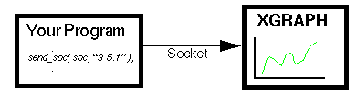
10. Sending Live-Data to XGRAPH from Running Program
You can send data directly to XGRAPH from another program, and see the data plotted as the program runs. The data does not need to be written to an intermediate file. Please see Live-Graphing for a full explanation.
11. Customizing / Editing Graphs
You can interactively manipulate and customize graphs, as well as store customized graphs for documentation and/or archiving.For example, you can:
- change, move, or add new textual annotations,
- select annotations to hide or show,
- change options,
- add, change, or remove files from the graph,
- add or change the graph title,
- add or change the axis labels,
- move the borders of the graph around the page (for example, to allow more space for axis-labels, or to place large textual explanations above, below, or along side the graph),
- draw new lines, or
- re-scale the X or Y axis numbers.
 |
 |
 |
 |
The following explains the individual options.
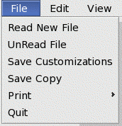
| Read New File | - |
You can open a new file for display of its data, or add a data file
to be displayed with others already loaded, by pressing this button.
A file browser will pop-up for you to enter or select a data file
for plotting.
|
|
UnRead File | - |
If you wish to remove a data file or option from the current display,
press this button. You will see a list of the currently loaded
files and options, where you have the opportunity to eliminate any of them.
This button, in combination with the Add Options button, can be
used to rearrange the order of the files and options. (For example,
to turn -pl points-on-lines or -c multi-column-file-mode
on before some files and off on others.)
|
|
Save Custom Graph (by copy) | - |
There are two ways to save your customizations: by copy, into ONE file,
or by reference to other files. There is a
distinct button for each method. The Save Custom Graph (by copy)
button causes all data AND customizations to be saved into one
convenient file of your choosing. This method is convenient for
archiving the results of individual experiments or data-sets.
With this, you may combine data from many files, together with your
specific annotations and explanations, into one file.
The customized graph-file can be retrieved at any later time.
It is convenient to use a naming convention for the save-file which
denotes the experiment, date, etc., to facilitate organizing large
collections of results. This method is also advantageous for
cases where you cannot be sure the constituent data-files will
remain.
You can re-load a saved file by invoking XGRAPH with just that file name.
|
|
Save Customization (by reference) | - |
As mentioned above, the Save Customizations (by reference)
button causes just your customizations to be saved in a file,
along with the include references to the data files you
are viewing. This method is convenient when you wish to view data
that is to be updated independently, or for common data that is to be
viewed from several different customization files.
You can re-load a saved file by invoking XGRAPH with just that customization file name. XGRAPH will follow all the references to load the data from the other files. You can also edit these file with a text editor. Customization files are syntactically the same as any other XGRAPH file. Their only distinction is their role.
|
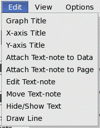
| Graph Title | - |
To add or modify a graph title, click the Graph Title
button. A pop-up text-window will appear to enter or modify your
graph title. You may then select ok or Apply.
In the former case, the graph's title change will be registered immediately,
but you will not see the graph title change on the graph until
next screen update. Selecting Apply forces an immediate
screen redraw.
|
| X-Axis Label | - |
To add or modify the X-axis (horizontal) label, click the X-axis Label
button. A pop-up text-window will appear to enter or modify the
axis label. You may then select ok or Apply.
In the former case, the label change will be registered immediately,
but you will not see the graph change on the graph until
next screen update. Selecting Apply forces an immediate
screen redraw.
|
| Y-Axis Label | - |
To add or modify the Y-axis (horizontal) label, click the Y-axis Label
button. A pop-up text-window will appear to enter or modify the
axis label. You may then select ok or Apply.
In the former case, the label change will be registered immediately,
but you will not see the graph change on the graph until
next screen update. Selecting Apply forces an immediate
screen redraw.
|
| Attach Text to Data | - |
There are two ways to add textual annotations to your graph:
data-space relative, and page-relative.
The first attaches your annotation to the coordinates of your
plotted data, such that, after panning or zooming, your annotation
will remain in the same position relation to your data, though
it will change its position on the screen or printed page.
(Some annotations will actually disappear from view when zoomed
into a different region of a graph.)
When you press this button, a pop-up window will appear for you to enter some text. After entering your text and clicking the ok button, then click-once at the place on your graph where you wish to attach the annotation. You will see the annotation appear where you clicked. Typically, data-relative annotations are used near data features in your graph, such as identifying individual curves or inflection points. These annotations are placed with the graph borders. The second method is described next.
|
| Attach Text to Page | - |
As mentioned above, there are two ways to add textual annotations to your graph.
This second method attaches your annotation to the coordinates of
the printed page (or window). Its position will not be affected by any
panning or zooming of your graph data. Typically, page-relative annotations
are used to provide longer explanations about the data set, conditions,
observations, etc.. These are often placed outside the graph borders,
perhaps, above, below, or aside of the graph. The Move Border
option is particularly helpful for providing more space around the graph
to accommodate longer discussions.
When you press this button, a pop-up window will appear for you to enter some text. You will notice that it has a larger, multi-line, test-box to accommodate longer descriptions than the previous annotation mode. After entering your text and clicking the ok button, then click-once at the place in the graph window where you wish to attach the text. You will see your added text appear where you clicked.
|
| Draw-Line | - |
Often it is helpful to add a line to your graph, perhaps to better
point at something you are annotating, or to show a critical
region on your graph. Of course you could add or manipulate
lines by editing a data-file. But, you can also add such lines
interactively (visually) with this button.
(The lines so-entered will be associated with the window or page,
not the data.)
To draw a line on your graph, click the Draw-Line button. Then click-once at the spot where you want the line to begin. Release, and move the mouse to the spot where you want the line to go to. Clicking a second time at the second point will produce the line on your graph. For extra help, you will see prompts in the text-window telling you what to do at each step of the process.
|
|
Select Text: On/Off | - |
You can change the status of annotations with the Select text
buttons. The first, labeled On/Off, allows you to show or
hide selected annotations. (This includes both annotations in your
data files, as well as the ones you entered interactively.)
This button has a toggling effect on selected annotations.
That is, toggling once will cause a hidden annotation to show,
while toggling the visible annotation will cause it to become hidden.
To toggle the visibility of an annotation, click the On/Off button, and then click once on the graph near the annotation. You should see the annotation change in visibility. (To point accurately at closely-spaced annotations, remember that an annotation's sensitive spot is at the left side of the first character on its first line.) Typically, the On/Off option is used when an overwhelming number of annotations are present and therefore suppressed, but you wish to bring out a few selected ones. Consequently, this mode assumes that the suppress-annotations (-sann) option must be activated. If not, this operation it will activate -sann automatically. You may see other annotations become hidden. Simply show the desired ones by toggling them On again with this button. Conversely, toggling global annotations back-on with the front-panel's Tog Anno button will cause all annotations to be displayed again. (Of course! They're still there!). But this will detract from any modified annotations. Toggling the global annotations back-off will restore your customizations.
|
|
Select Text: Move | - |
You can move any annotation or text-note by clicking the Move
button. Then click-once on the annotation you wish to select.
Release, and move the mouse to where you want to place the annotation.
Then click once more where you want the annotation placed.
You will see the annotation appear in the new location.
(The data-or-screen relative-status is unaffected by this operation.)
|
|
Select Text: Edit | - |
To modify an annotation or text-note, click the Edit
button. Then click-once on the annotation you wish to edit.
A pop-up text-window will appear with the selected annotation
inside it. After editing it, click Apply button. You will see
the modified annotation on the graph.
|
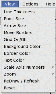
| Move Borders | - |
It is often useful to re-position the boundaries of the graph on
the screen or printed-page, to allow more space for axis label names,
or textual notes and explanations around the graph. You can move
the four borders independently by pressing the Move Borders
button. A pop-up window will appear that shows you the current border
position settings, and allows you to modify them.
The border positions are specified in inches relative to an 8.5x11 sheet of paper in landscape orientation. The positions within a screen window are directly proportioned to this as well. (Sometimes it is helpful, to avoid much trial and error, to use a ruler with a printed graph to reach good settings quickly.)
|
|
Scale X-axis Numbers | - |
Sometimes it is desired to change the units with which the axis
numbers were labeled. For example, from minutes to nano-seconds,
for volts to kilo-volts. You can change the axis-label with the
axis-label buttons. To change the X-axis numbers, click the
the Scale X-axis Numbers button. A pop-up window appears
allowing you to enter a scale factor. This will not change the
data on the graph, nor its positioning.
For example, suppose an experiment produced data ranging from 0.00002-seconds to 0.00005-seconds. Certainly such a span is unwieldy to express in seconds. Instead, you could change the axis label from being (units are seconds) to read (units are micro-seconds), and re-scale the x-axis numbers by 1.0e+6, to show values ranging 20-uS to 50-uS. The data and its position on the graph will be unaffected.
|
|
Scale Y-axis Numbers | - | Similar to Scale X-axis Numbers above, but for the Y- (vertical) axis. |
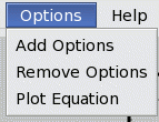
| Add Options | - | You can add or modify the command-line options while the graph is displayed. For help on available options, see Command-line Options. |
12. Compressed Input
XGRAPH incorporates the dynamic SCZ decompression algorithm. It enables graph files to be stored in compressed (.scz) format, and directly displayed by XGRAPH without manually decompressing them. For large files, this accelerates graphing, because it significantly reduces file I/O.The feature is automatic. Any file ending with the .scz suffix will be decompressed on-the-fly. Utilities and routines for compressing and decompressing files can be downloaded from the open-source SCZ project.
13. Download a Copy of XGRAPH for Your Site
If you do not already have XGRAPH installed at your site, you can download it by clicking below:
- xgraph.tar.gz - (for PC's running Linux (eg. Redhat,Ubuntu,Mint))
- xgraph.zip - (for MS-Windows)
- xgraph.tar.gz - (for Apple Mac OS-X) (8-22-2025)
- xgraph.tar.gz - (for PC's running FreeBSD)
An example data file is included in the packages for quick testing: testxy.dat [1-KB]
Test with: xgraph testxy.dat
To be notified of major XGRAPH updates, send mail to xgraphadmin@xgraph.org.
If you have any trouble, write to xgraphadmin@xgraph.org.
You can support XGraph updates and new features at:
Every bit helps.
14. History
XGraph was introduced by MPagan in 1985. Enhanced by CHein, ARubin, TRegovich, and others, and continues to be used and supported by several organizations and projects, including CSIM and RASSP.
Please report comments, problems, or suggestions to: xgraphadmin@xgraph.org
Origins:
- xy.c - 1982, Under Case Western Unix, a basic character oriented plotter from Chein.
- xy2.c - 1983, ported to VAX VMS.
- xgraph v0 - 1985, MPagan ported xy2 to ReGis Graphics display, named it XGRAPH.
- xgraph v1.0 - 1987, Ported Open Windows display.
- xgraph v1.1 - 1989, Ported to X-windows.
- xgraph v1.3 - 1992, Enhanced interactive extensions.
- xgraph v1.4 - 1995, Web documented.
- xgraph v1.5 - 1997, Added log plotting capabilities.
- xgraph v1.6 - 1999, Added interactive customization features.
- xgraph v1.7 - 2000, Jan, Added Hyper-Notes capabilities.
- xgraph v1.8 - 2000, June, Added command-line "piping" option.
- xgraph v1.9 - 2001, May, Forward-backward buttons.
- xgraph v1.10 - 2002, July, Several minor enhancements/fixes.
- xgraph v1.11 - 2002, Nov, Several minor enhancements/fixes.
- xgraph v1.12 - 2003, Aug, A4 paper sizes, click coords.
- xgraph v1.52 - 2011, Revised printing capabilities. Added -liv4 option.
- xgraph v4.00 - 2012, Ported to Gtk graphics.
- xgraph v4.10 - 2012, Added option to plot equations and functions interactively.
- xgraph v4.20 - 2014, Feb - Several minor improvements. Handles spaces in path-names. Added ability to monitor data files for changes.
- xgraph v4.30 - 2014, April - Re-activated the -soc option for live socket data.
- xgraph v4.38 - 2018, July - Minor fixes.
- xgraph v4.39 - 2022, Mar, General maintenance and updating.
- xgraph v4.40 - 2024, Sep, General maintenance and updating.
- xgraph v4.42 - 2025, Aug, Upgraded from Gtk-2 to Gtk-3 to support newer iMacs.
Related Tools
See also:- XYZ-2-WF - 3D Data Plotting. Converts matrix data into 3D surface-plots or bar-graphs for highly
interactive viewing with WF3D. (Numeric visualization.)
- XYZ - Like the XGRAPH, but plots 3-D data on mesh plot.
- CONTOUR - Like XYZ, but produces a contour map of 3-D data.
- SOLIDXYZ - Like the XYZ, but renders solid surface view of 3-D data.
- Num-Util - Numeric Utilities, useful for manipulating graph-data in files.